
Table of Contents
This post contains affiliate links. If you click through and buy something, I may earn a small commission — at no extra cost to you. I only recommend tools I’ve actually used or thoroughly researched.
Blog design for beginners is one of those topics where the advice either goes too deep into technical detail or stays so vague it’s useless. This post tries to do neither.
Good blog design isn’t about making something beautiful for its own sake. It’s about making something easy to read, easy to navigate, and easy to trust — so visitors stay longer, read more, and come back.
I’ve made most of the design mistakes on this list on thesidehustler.blog in the early days. Here’s what actually matters.
New to blogging? Get the foundation right first — Hostinger gets your WordPress blog live in under an hour from $2.69/month with a free domain. Then use these design principles to make it look the part.
Blog Design for Beginners: The 8 Rules That Actually Matter
Rule 1: Choose a Simple, Fast Theme — Not a Beautiful, Complicated One
The single biggest design mistake new bloggers make is choosing a visually impressive theme that loads slowly and confuses readers with too many elements.
Your theme should be:
- Fast — page load speed directly affects SEO rankings and reader retention. Heavy themes with lots of animations and loaded libraries drag your site down.
- Clean — a minimal design puts the focus on your content, not on the design itself.
- Mobile-responsive — over 60% of web traffic now comes from mobile devices. If your blog looks bad on a phone, you’re losing the majority of your readers.
The themes I’d recommend for new bloggers: Astra, Kadence, and GeneratePress. All three are fast, clean, mobile-responsive, and have solid free versions. Install one of these and resist the urge to switch for at least six months.

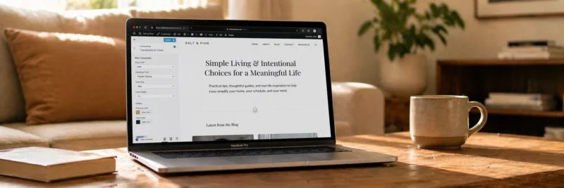
Rule 2: Pick Two Fonts and Stick With Them
Typography is one of the most overlooked elements of blog design — and one of the most impactful.
Two fonts is the standard: one for headings, one for body text. Mixing three or four fonts makes a blog look amateur, not creative.
What to look for in a body font: Easy to read at 16–18px, good spacing, clear letter forms. Georgia, Lato, Open Sans, and Merriweather are all solid choices for body text. Avoid anything too decorative — ornate fonts are tiring to read across 2,000 words.
What to look for in a heading font: Can be slightly more distinctive than the body font, but should still be legible at all sizes. It should complement the body font, not clash with it.
Google Fonts has hundreds of free options and tells you which fonts pair well together. Pick a pairing, set it in your theme’s customizer, and leave it.
Font size: Body text should be at least 16px — anything smaller is difficult to read, especially on mobile. Most modern themes handle this well by default, but worth checking.
Rule 3: Keep Your Color Palette to Three Colors
A coherent color palette makes a blog look intentional and professional. A scattered one looks like it was designed by committee.
Three colors is the standard:
- Primary color — your brand color. Used for links, buttons, and key accents.
- Secondary color — a complementary color for supporting elements.
- Neutral — white, off-white, or light gray for backgrounds. Your content needs breathing room.
Pick colors that reflect your niche and audience. A personal finance blog might use trustworthy navy and clean white. A food blog might use warm terracotta and cream. A blogging tips blog might use something clean and modern — thesidehustler.blog uses a simple palette that keeps the focus on the content.
Use a tool like Coolors to generate color palettes if you’re not sure where to start. It shows you which colors work well together and lets you adjust until you find something that fits.
Rule 4: Design Your Navigation for the Reader, Not for You
Your navigation menu is how readers find their way around your blog. It should reflect what readers want to find — not what you want to show them.
Keep it simple: Five items maximum in the main navigation. More than that overwhelms readers and dilutes the important links.
Include the essentials:
- Home
- Blog (if your homepage isn’t your blog)
- About
- Start Here or Best Posts (a curated entry point for new readers)
- Contact
What to avoid: Dropdowns with twelve sub-items, navigation that changes completely on mobile, links to pages that don’t exist yet.
Your navigation should answer one question for a new visitor: “where should I go first?” Make that answer obvious.
Rule 5: Use White Space Generously
White space — the empty space between elements — is not wasted space. It’s what makes content readable.
Dense, cramped text with no breathing room feels overwhelming and pushes readers away before they’ve even started reading. Generous white space signals to the reader that this is a calm, trustworthy place to spend time.
Practical white space rules:
- Short paragraphs — 2 to 3 sentences maximum
- Line height of at least 1.6 for body text (most good themes set this automatically)
- Clear spacing between sections and headings
- Avoid letting images and text crowd each other
The biggest white space improvement most new blogs can make is simply breaking up long paragraphs. If a paragraph is more than four sentences, split it.

Rule 6: Make Your Blog Fast
Design isn’t just visual — performance is part of design. A slow blog is a bad experience regardless of how good it looks.
The biggest causes of slow blogs:
- Uncompressed images — by far the most common culprit. Use Smush or ShortPixel to compress images automatically on upload.
- Too many plugins — every plugin adds load. Keep your plugin list lean (see the WordPress plugins post for the essential list).
- A heavy theme — avoid themes that load unnecessary scripts and stylesheets.
One advantage of Hostinger: LiteSpeed Cache is built into every plan, which handles caching automatically. You don’t need a separate caching plugin — it’s already running in the background.
Test your site speed at Google PageSpeed Insights — it’s free and shows you exactly what’s slowing your site down and how to fix it.
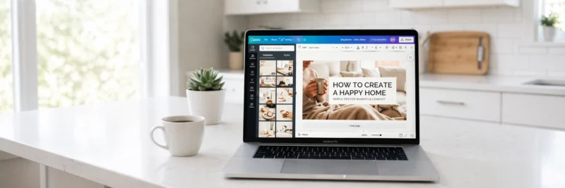
Rule 7: Design Your Hero Image and Header Consistently
Your hero image (the main image at the top of each post) and your header (your blog name and navigation) are the first things a reader sees. They set the tone for everything that follows.
Hero images:
- Use consistent dimensions across all posts — 1200 x 630px is a solid standard
- Warm, lifestyle-feel images perform better than stock photos of people staring into cameras
- Include your blog’s visual style — consistent color treatment or overlays help posts feel cohesive
- Canva makes creating these straightforward — the free version has everything you need
Header:
- Your blog name should be immediately legible — not buried in decoration
- The header should load instantly — avoid heavy animations or JavaScript-dependent elements
- A simple logo or text-based header often performs better than a complicated graphic
Rule 8: Make Your Calls to Action Clear and Consistent
Every page on your blog should have one clear next step for the reader — a call to action (CTA). Your design should make that CTA easy to see and act on.
Common blog CTAs:
- Email list sign-up — your most valuable CTA for long-term growth
- Recommended reading — keep readers on your site and in your content cluster
- Affiliate product — where relevant, a naturally placed recommendation
Design principles for CTAs:
- Use a button color that contrasts with your background — it should stand out without clashing
- Keep the copy clear and benefit-led — “Get free blogging tips” beats “Subscribe”
- Don’t bury CTAs at the bottom of posts — place them at natural breaks in the content
Tools for Blog Design
Canva — design hero images, Pinterest graphics, social media posts, and any other visual elements. Free tier covers everything most bloggers need.
Google Fonts — free, high-quality fonts that integrate directly with WordPress through most themes.
Coolors — color palette generator. Pick three colors and run with them.
Google PageSpeed Insights — free speed testing tool directly from Google.
WordPress Theme Customizer — most of your visual settings (fonts, colors, header, footer) are controlled here. No coding required.
The Design Mistake That Costs New Bloggers the Most Time
Spending weeks on design instead of publishing content.
A clean, simple, readable blog beats a beautifully designed blog with no content — every single time. Design improves with iteration over months. Content compounds from day one.
Get your theme set up in a day, apply these eight rules, and then focus on writing. Come back to design when you have traffic worth designing for.
Get your blog live on Hostinger — free domain, WordPress installed in minutes, and a solid foundation to design on top of.
Recommended reading: How to Set Up a WordPress Blog: 11 Essential Steps for Beginners
Recommended reading: WordPress Plugins for Bloggers: The Only 8 You Actually Need
Recommended reading: How to Start a Blog in 2026 (Simple Step-by-Step Guide)
What’s the design element you struggled most with when starting your blog? Drop it in the comments.