Table of Contents
This post may contain affiliate links, meaning we may earn a small commission at no extra cost to you. We only recommend products we trust, and your support helps us continue creating helpful content.
I have a confession to make. Early in my blogging journey, I was obsessed with Pinterest “vanity metrics.” I would refresh my dashboard and celebrate every time a Pin went viral, watching those thousands of monthly viewers flood into my Google Analytics.
But there was a problem. My bank account wasn’t moving. My email list was stagnant.
I realized that I was excellent at getting people to “click,” but I was terrible at getting them to “stay.” I was sending high-intent Pinterest traffic to generic, cluttered blog posts that took six seconds to load and had no clear direction. I was essentially inviting people into my home and then pointing them toward a messy closet.
If you want to turn scrollers into subscribers and buyers, you need a dedicated Pinterest landing page design. In 2026, Pinterest users have less patience than ever. They are on a mission to find a solution, and your landing page is the only thing standing between them and that “Eureka!” moment.
In this guide, I’m breaking down the “Anti-Hustle” framework for building high-converting landing pages that respect your audience’s time and maximize your revenue.
Section 1: The “Pinterest Mindset” – Why Standard Pages Fail
To master Pinterest landing page design, you first have to understand the psychology of a Pinterest user. Unlike Google users, who are searching for specific answers, or Facebook users, who are looking for social connection, Pinterest users are visual explorers.
They are in a “discovery” phase. When they click a Pin, they are looking for a continuation of the visual promise made on that Pin. They aren’t looking for your homepage; they aren’t looking for your latest “life update” blog post. They want the specific value promised in that 1000×1500 pixel image.
The “3-Second Rule” of Pinterest Traffic
Pinterest traffic is notoriously “flighty.” If a user clicks a Pin and the landing page doesn’t look like the Pin, or if it takes too long to load, they will hit the back button faster than you can say “conversion rate.”
Standard blog posts often fail as landing pages because they contain too much “noise.” The sidebar is filled with ads, the header has ten different navigation links, and the content itself is buried under several paragraphs of introductory fluff. To optimize for Pinterest landing page design, you must remove every obstacle between the user and the “click” they just made.
Section 2: The “Visual Scent” Audit & Cognitive Fluency
One of the most powerful concepts in modern marketing is Cognitive Fluency—the brain’s preference for information that is easy to process. When a user clicks from Pinterest to your site, they need to feel an immediate sense of familiarity. This is what designers call “maintaining the visual scent.”
Section 3: Mobile UX & The “Thumb-Zone” Mapping
Since over 80% of Pinterest users browse via the mobile app, your Pinterest landing page design must be “Thumb-Optimized.” This goes far beyond standard mobile responsiveness; it is about the physical ergonomics of how people hold their phones.
The Science of the “Green Zone”
Mobile interaction researcher Steven Hoober discovered that the majority of users interact with their phones using one hand. This creates a “Thumb Zone”—an arc of space that is easy to reach without stretching or repositioning the hand.
Section 4: Technical Optimization – Speed as a Conversion Metric
In the world of Pinterest landing page design, speed is not just a technical metric; it is a trust factor. A slow-loading page feels “broken” or “sketchy” to a modern user. According to Google, if a page takes longer than three seconds to load, the probability of a bounce increases by over 90%.
Pinterest’s “In-App” Browser Challenge
When a user clicks your Pin, your website loads inside Pinterest’s own “in-app” browser. This browser is often slower and more resource-intensive than Chrome or Safari. To succeed, your page must be lean.
The Speed Optimization Checklist:
- Leverage [AFFILIATE LINK: Elementor] Cloud: Having a server that is specifically optimized for high-performance builders can shave 500ms off your Time to First Byte (TTFB).
- Convert to WebP: Stop using JPEGs and PNGs. WebP images are roughly 30% smaller without any loss in visual quality.
- Eliminate Render-Blocking JavaScript: If you have a fancy animation that doesn’t show up until the bottom of the page, don’t let it slow down the loading of your “Above-the-Fold” content.
- Use “Lazy Loading”: This ensures that images only download as the user scrolls down to them, significantly improving the initial load speed.
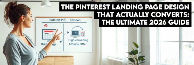
Section 5: The “Bridge Page” Strategy for Affiliate Marketers
If you are an affiliate marketer, you have likely run into Pinterest’s strict rules regarding direct affiliate links. Sometimes they are blocked; other times, they simply don’t convert because the traffic is too “cold.” The solution is a Bridge Page.
A Bridge Page is a specific type of Pinterest landing page design meant to “warm up” the audience before sending them to the vendor’s sales page.
The 4-Part Bridge Page Framework:
- The Acknowledgment: Start with a headline that validates why they clicked. “Looking for the Best Yoga Mat for Back Pain?”
- The Value Addition: Provide a “Micro-Review.” Don’t just list the features; list the benefits you personally experienced.
- The Visual Proof: Show a video or high-quality image of the product in a real-world setting.
- The “Anti-Hustle” CTA: Use low-friction language. Instead of “Buy Now,” use “Check the Current Price on Amazon” or “See if it’s Still in Stock.”
By using this Pinterest landing page design approach, you position yourself as a helpful guide rather than a pushy salesperson, which is the key to building long-term affiliate wealth.
Section 6: Advanced Landing Page Architecture
The “Scroll-Stoppers”
When a user is scrolling down your page, their attention will naturally dip. You need to insert “scroll-stoppers”—visual or structural elements that re-engage their brain.
- Bullet Points with Icons: Use checkmarks or custom icons to make your benefits scannable.
- Comparison Tables: People love comparing options. A simple table showing “The Old Way” vs. “Your Solution” is a powerful conversion tool.
- Social Proof Strips: A horizontal strip of logos (from places you’ve been featured) or small headshots of happy customers provides an immediate credibility boost.
| Tool | Best For | Why for Pinterest? |
| Elementor | Full Design Control | Best for creating “Visual Scent” continuity. |
| Leadpages | Speed & Simplicity | Pre-optimized for high-conversion mobile traffic. |
Swipe Pages | Mobile-First Experience | Features “Mobile Swipe” pages that feel like an app. |
| Kit (Formely Convert Kit) | Lead Capturing | Seamless integration for Pinterest-specific email funnels. |
Section 7: The Data-Driven Designer – A/B Testing Your Success
You cannot improve what you do not measure. To maximize your Pinterest landing page design, you must move beyond “gut feelings” and look at the raw data.
What to Test First:
- The Headline: Test a “How-To” headline against a “Fear of Missing Out” (FOMO) headline.
- The CTA Color: Does a high-contrast orange button outperform a brand-aligned blue button? (Often, the “ugly” high-contrast color wins).
- Hero Image Style: Test a photo of a person looking at the camera versus a “Product-only” shot.
Use a tool like Leadpages, which has built-in A/B testing, or Google Optimize to run these experiments. Even a 1% increase in conversion rate can result in thousands of dollars of extra revenue over the course of a year.
Section 8: The Future of Pinterest Pages (2026 and Beyond)
As AI and interactive web technologies continue to evolve, Pinterest landing page design is moving toward personalization.
Dynamic Content Replacement
Imagine a landing page that changes its headline based on what the user searched on Pinterest. If they searched “Intermittent Fasting for Women,” the page says that. If they searched “Intermittent Fasting for Beginners,” the page adjusts. This level of personalization is becoming the standard for top-tier affiliate marketers.
Interactive Micro-Quizzes
Instead of a standard opt-in form, many successful creators are using 2-3 question “micro-quizzes.” “What is your #1 blogging struggle?” Once the user clicks an answer, they are “invested” in the outcome, making them 50% more likely to provide their email address to see the results.
6-Question FAQ: Pinterest Landing Page Design
Do I really need a separate landing page for every Pin?
Not necessarily for every individual Pin, but you should have a unique Pinterest landing page design for every unique offer or topic category. If you have ten Pins about “Vegan Meal Prep,” they can all point to one high-converting Vegan Meal Prep landing page. The goal is to ensure that the content the user sees after clicking is a direct continuation of the promise made on the Pin. Sending all your Pinterest traffic to your generic homepage is the fastest way to kill your conversion rate because it forces the user to work to find what they were looking for.
What is the most important element of a Pinterest landing page?
Without a doubt, it is Visual Congruency. When a user clicks a Pin on the Pinterest app, they are effectively “teleporting” to your site. If the color scheme, fonts, and overall “vibe” of the page don’t match the Pin, the user experiences a moment of cognitive dissonance. Their brain tells them, “This isn’t what I clicked on,” and they will instinctively hit the back button. To maximize Pinterest landing page design success, make sure your hero image and headline are nearly identical to the elements on the Pin itself.
How do I make my landing page load faster for mobile users?
Speed is the “silent killer” of Pinterest landing page design. To optimize for mobile, first, ensure you are using a lightweight theme or a dedicated builder like Elementor. Second, compress all your images using the WebP format. Third, eliminate unnecessary scripts and “heavy” plugins that load in the background. Pinterest’s in-app browser is less powerful than a standard desktop browser, so if your page feels a little slow on your computer, it will feel painfully slow to someone clicking through from their phone. Aim for a load time of under 2 seconds to keep your bounce rates low.
Should I use pop-ups on my Pinterest landing page?
Generally, no. For Pinterest landing page design, pop-ups can be extremely frustrating, especially on mobile devices where they are often difficult to close. Pinterest users have very little patience, and an intrusive pop-up the moment they arrive is often seen as a barrier to the information they want. Instead of a pop-up, use an “inline” opt-in form or a clear, high-contrast CTA button. If you absolutely must use a pop-up, set it to “exit-intent” only, so it only appears when the user is about to leave the page anyway.
Can I use a standard blog post as a landing page?
You can, but you need to “clean it up” specifically for Pinterest traffic. A standard blog post is often cluttered with sidebars, related posts, and advertisements that distract the user from the primary goal. To turn a blog post into a high-quality Pinterest landing page design, I recommend using a “blank” template (like Elementor Canvas) that removes the header, footer, and sidebars. This keeps the user focused on the specific call-to-action you want them to take, whether that’s joining your email list or clicking an affiliate link.
How do I know if my landing page design is actually working?
The only way to know for sure is to track your data. You should look at two specific numbers: your Click-Through Rate (CTR) from Pinterest to your site and your Conversion Rate on the page itself. If your CTR is high but your conversion rate is low, it means your Pin is great, but your Pinterest landing page design is failing to deliver on the promise. Use a tool like Google Analytics or a “heatmap” tool like Hotjar to see where users are clicking and where they are dropping off. Small tweaks to your headline or button color can often lead to massive jumps in conversions.
Recommended Reading
- How to Start a Profitable Blog in 2026 (The Ultimate Step-by-Step Guide for Beginners)
- How to Write Your First Blog Posts (Beginner’s Guide)
- Pinterest Pin Design Mastery: 15 Visual Strategies That Get High-Converting Clicks
- How to Promote Your Blog on Pinterest in 2025
- Monetize Your Blog: 10 Proven Ways to Make Money in 2025
- Pinterest Marketing Tips to Drive Blog Traffic & Grow Fast
Respect the Click
Designing a Pinterest landing page design is about more than just aesthetics; it’s about respecting the user’s journey. When someone clicks your Pin, they are giving you their most valuable asset: their attention.
The “Anti-Hustle” way to honor that attention is to provide a fast, beautiful, and highly relevant experience that gives them exactly what they asked for. By focusing on congruency, mobile speed, and clear CTAs, you stop being a “traffic chaser” and start being a “conversion master.”
Ready to build your bridge? Start with one niche, one Pin, and one dedicated landing page. You’ll be amazed at the difference it makes.