
Table of Contents
This post contains affiliate links. If you click through and buy something, I may earn a small commission — at no extra cost to you. I only recommend tools I’ve actually used or thoroughly researched.
Your Pinterest pin design is the first thing anyone sees. Before they read your title, before they check who posted it, before they decide whether to click — they see the image. If it doesn’t stop them scrolling, nothing else gets a chance.
The good news is that creating pins people click doesn’t take design skills or expensive software. It takes understanding what works on Pinterest and applying a few simple principles every single time.
This guide covers all of it — pin dimensions, design principles, tools, and a simple workflow for making pins that actually perform.
Recommended reading: Pinterest SEO for Beginners
Why Pinterest Pin Design Matters More Than Most Beginners Realize
A lot of bloggers pour real effort into keyword research and scheduling, then throw together a pin image in five minutes and wonder why they’re not getting clicks.
Pinterest is a visual platform. The image is the product. A pin with perfect keywords but a weak design will lose, every time, to a pin with so-so keywords and a strong design.
The flip side is true too — a beautiful pin with no keywords behind it won’t get found in search. Design and SEO work together. But if you had to pick one, design is what drives the click. Keywords are what get you in front of the right person. You need both.
Pinterest’s own guidance points the same way: pins with strong visual elements clearly outperform those without, and text overlay is one of the biggest drivers of click-throughs. In other words, what you put on the pin image matters as much as the image itself.
According to Pinterest’s creative best practices, vertical pins with clear text overlay and a strong focal point consistently outperform other formats. That’s not a suggestion — it’s the data talking.
Pinterest Pin Dimensions: Get This Right First
Before anything else, get your dimensions right. Pinterest is built for vertical content, and pins that don’t fit the standard ratio get cropped, displayed awkwardly, or pushed down the feed.
Standard pin size: 1000 x 1500 pixels (2:3 ratio)
This is the format Pinterest recommends and the one that performs best across desktop and mobile. Stick to it.
Some creators use a 1000 x 2100 pixel format for longer pins. They can work, but Pinterest has been known to cut off very long pins in the feed. The standard 2:3 ratio is the safe choice.
What to avoid:
- Square pins (1:1) — they work on Instagram, not on Pinterest
- Horizontal/landscape pins — they take up less feed space and get less engagement
- Any size that isn’t close to a 2:3 ratio
Set up your Canva template at 1000 x 1500 pixels and use it every time.
The Elements of a High-Performing Pinterest Pin
Every pin that performs well shares the same core elements. Here’s what they are and why each one matters.
A Strong Focal Image
Your background image sets the tone for the pin. It should be relevant to your content, easy on the eye, and clear enough that text overlay stays readable on top of it.
Good sources for free images:
- Unsplash — high quality, truly free, huge library
- Pexels — similar to Unsplash, excellent quality
- Canva’s built-in image library — millions of images right inside the editor
Avoid busy, cluttered images where text overlay becomes hard to read. Simple backgrounds with a clear focal point work best.
Clear, Readable Text Overlay
This is the most important part of your pin design. The text needs to communicate — at a glance, on a small screen — exactly what the reader gets if they click.
Rules for text overlay that works:
- High contrast — light text on dark backgrounds, dark text on light backgrounds. If you have to squint to read it, it’s not working.
- Large enough to read on mobile — most Pinterest users are on their phones. If your text reads fine on desktop but tiny on mobile, it’s not readable.
- One main headline — don’t try to say everything on the pin. One clear benefit or promise is enough.
- Simple fonts — decorative fonts look nice but are often hard to read fast. A clean sans-serif headline paired with a simple body font is almost always the right call.
Consistent Branding
Using the same fonts, colors, and general layout across your pins makes your content recognizable over time. Once someone has seen your pins and liked them, a consistent look helps them spot your new ones in the feed — and makes them more likely to click.
This doesn’t mean every pin looks identical. It means they should feel like they come from the same place — similar color palette, the same two or three fonts, consistent logo placement.
Your Logo or Website URL
Add a small logo or your website URL to every pin. It reinforces your brand, and if someone screenshots or saves your pin without clicking through, they still know where it came from.
Keep it subtle — bottom of the pin, small size. It shouldn’t compete with your headline.
How to Create Pinterest Pins in Canva
The tool most bloggers use for pin design is Canva, and it’s what I’d point a beginner to. I use it myself — not only for pins — and for someone starting out it’s a far smarter choice than dropping real money on a design package like Photoshop. The free version has everything you need for pins: Pinterest templates, a huge image library, fonts, and a drag-and-drop editor that takes zero design experience.
If you want a structured walkthrough of the whole process rather than figuring it out as you go, Meagan Williamson’s Pinterest Beginners Course covers pin creation as part of a full beginner course. I took it myself, and it’s taught by someone who has been doing this since Pinterest’s early days.
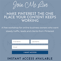
Free Pinterest Training Workshop
Content ideas are only useful if your Pinterest strategy is solid enough to make them work. Meagan Williamson’s free workshop — The Discovery Loop — covers the full system so your content actually gets found.
Setting Up Your Canva Pin Template
- Open Canva and click Create a design
- Search for “Pinterest Pin” — Canva has preset templates at the correct dimensions
- Or click Custom size and enter 1000 x 1500 pixels
- Choose a template as your starting point, or start from a blank canvas
The templates are really useful for beginners — they give you a working design you can customize instead of staring at a blank page. Pick one that fits your blog’s style and adapt it.
Creating Your Brand Templates
Once you’ve designed a pin you’re happy with, save it as a template. Duplicate it for each new pin and swap out the image and headline. This is how experienced Pinterest creators make pins quickly — they’re not designing from scratch every time.
Aim for 3–5 pin templates in your brand style. Rotate through them to keep your content looking fresh without redesigning every pin from the ground up.
Canva Tips That Save Time
- Use the brand kit (on the free plan) to save your fonts and colors so they’re always one click away
- Batch your pin creation — open all your blog posts in separate tabs, then work through making pins for each one in a single Canva session
- Use Canva’s Pinterest integration — you can publish straight from Canva to Pinterest without downloading and re-uploading
How Many Pins Should You Create Per Blog Post?
The standard advice is 3–5 pin designs per blog post, and it’s good advice. Here’s why.
Each design is a separate chance to show up in search. Different designs appeal to different readers. A bold, text-heavy pin might beat a soft lifestyle-image pin for the same post — or the other way around. You won’t know until you test.
Multiple designs also give you more to schedule over a longer stretch. One blog post with five pin designs can fill two weeks of Pinterest content if you space them out.
Vary these across your designs:
- The headline — try different angles on the same topic
- The background image — lifestyle photo vs flat lay vs graphic background
- The layout — text at the top vs bottom vs center
- The color scheme — within your brand palette, try light and dark versions
Keep the destination URL the same. Everything else can vary.
Pinterest Pin Design Mistakes to Avoid
I’ll start with the one I’m guiltiest of. When I began, I burned a big chunk of my first month making version after version of the same pin — nudging fonts, swapping colors, second-guessing every layout. It felt productive. It wasn’t. You’re far better off getting a few solid pins out the door and letting the data tell you what’s working than polishing one pin to death. Don’t make my mistake.
Too much text. Your pin isn’t the blog post — it’s the doorway to it. One clear headline is enough. If you’re cramming three paragraphs onto a pin, pull back.
Low contrast text. White text on a light image, or dark text on a dark image, is the single most common design mistake on Pinterest. If your text isn’t instantly readable, your design isn’t working.
No text overlay at all. Beautiful photography with no text performs well in niches like food and travel, but for most blogging niches — personal finance, side hustles, marketing — text overlay is essential. It tells the reader what they’ll get before they click.
Inconsistent branding. Pins that look completely different every time make it hard for readers to recognize your content. Build a brand style and stick to it.
Using horizontal images. Easy mistake when you’re pulling images from a blog post that were built for a horizontal layout. Always create pins at the correct vertical ratio — don’t just drop a horizontal image into a vertical canvas and leave empty space.
Tiny text. Design your pins on a laptop, then check how they look on your phone before scheduling. What reads fine on a 15-inch screen often turns to mush on a 6-inch one.
What Makes a Pinterest Pin Title Worth Clicking
Your pin title — the text you add in the Pinterest interface when you upload the pin — is separate from the text overlay on the image itself. Both matter, but the title pulls extra weight for SEO.
A good pin title:
- Includes your primary keyword naturally
- Communicates a clear benefit or promise
- Is specific enough to be useful (“5 Pinterest Pin Design Tips That Get More Clicks” beats “Pinterest Tips”)
- Is written for humans, not just search algorithms
Full guide: Pinterest Pin Titles and Descriptions
A Simple Pin Design Workflow
Here’s how to make pin creation fast and repeatable.
Step 1: Keyword first. Before you open Canva, do a quick keyword search on Pinterest for your blog post topic. Note the top 2–3 keyword phrases. They’ll shape your pin headline.
Step 2: Open your template. Duplicate your brand template in Canva — don’t design from scratch.
Step 3: Swap the image. Pick a relevant background from Unsplash, Pexels, or Canva’s library.
Step 4: Write your headline. Use your keyword naturally in a benefit-driven headline. Keep it short enough to read at a glance.
Step 5: Create variations. Duplicate the design 2–3 times and vary the image and headline across each version.
Step 6: Download and schedule. Download all versions and drop them into your scheduling queue.
The whole thing for one blog post — three variations — takes about 20 minutes once your templates are set up.
Final Thoughts
Pinterest pin design doesn’t need to be complicated or slow. Set up a handful of brand templates, learn the principles that make pins clickable, and apply them consistently.
The bloggers getting the best results from Pinterest aren’t the best designers. They’re the ones who understand what their audience responds to and make pins that deliver it — clearly, consistently, and often.
Start with one good template. Get comfortable with it. Then expand.
Next step: Pinterest Pin Titles and Descriptions
Nailing your pin design is one habit. There are five more that matter just as much, and I’ve put the lot on one page. Grab the free Pinterest Starter Checklist below and work down it this week.
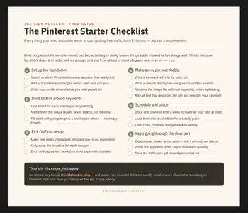
Download Your Free Pinterest Starter Checklist
Grab the free one-page checklist that shows you exactly what to do first, next, and after that.